Daniel Smith
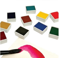
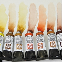
Daniel Smith are considered the best watercolor paints in the world! They are hand-made, manufactured in America since 1993 and are famous for their unique extra-fine pigments, which create colors with great intensity but also excellent stability and lightfastness. Let your imagination run wild, capture nature, paint animals, portraits, romantic landscapes. Use brushes, your fingers, blend and mix your colors to discover inspiring new combinations, experiment with pouring! Whether you are a professional watercolorist or an amateur who loves quality, Daniel Smith will support your every choice!
Display
per page
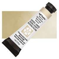
Daniel Smith Extra Fine Watercolor Tube 5ml - Buff Titanium
Spatter or drop a brushload of Buff Titanium into a moist wash and enjoy the pigment displacement, it is especially effective used that way to make clouds in the sky. Unique to DANIEL SMITH, Buff Titanium resembles the ecru shades of sand and antique lace and simulates the porous texture of an eggshell. It is a most welcome neutral, with its’ semi-transparent to opaque, non-staining properties. Pre-mix Buff Titanium with Quinacridone Rose or Perinone Orange for subtle hues and matte surfaces ideal for the velvety petals of your favorite flowers. Mix with Indigo or Van Dyke Brown to create slate-colored shadows and soft feathers. Glaze a dried landscape with a misty, atmospheric mood.
€9.90
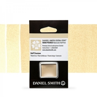
Daniel Smith Extra Fine Watercolor Half Pan - Buff Titanium
Spatter or drop a brushload of Buff Titanium into a moist wash and enjoy the pigment displacement, it is especially effective used that way to make clouds in the sky. Unique to DANIEL SMITH, Buff Titanium resembles the ecru shades of sand and antique lace and simulates the porous texture of an eggshell. It is a most welcome neutral, with its’ semi-transparent to opaque, non-staining properties. Pre-mix Buff Titanium with Quinacridone Rose or Perinone Orange for subtle hues and matte surfaces ideal for the velvety petals of your favorite flowers. Mix with Indigo or Van Dyke Brown to create slate-colored shadows and soft feathers. Glaze a dried landscape with a misty, atmospheric mood.
€12.90
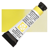
Daniel Smith Extra Fine Watercolor Tubes 5ml - Bismuth Vanadate Yellow
This opaque yellow, leaning slight towards green, appears opaque in mass tone, yet lifts cleanly. It is low staining, making it excellent in portrait mixtures for dark flesh tones. Use concentrated to diluted mixtures in florals and field flowers. Its lemon yellow hue works well with purples and all the greens.
€11.60
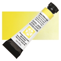
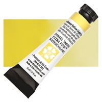
Daniel Smith Extra Fine Watercolor Tube 5ml - Hansa Yellow Light
Cleaner, more transparent and brighter in chroma than Cadmium Yellow Light, this is a high-tinting, organic pigment. Hansa Yellow is considered the ‘perfect yellow’, offering more control when mixing. Painters admire the purity of this primary pigment and ability to adjust its temperature while avoiding a gray from a hidden complement. Think of a yellow pepper.
€9.90
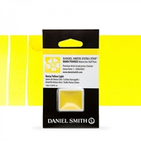
Daniel Smith Extra Fine Watercolor Half Pan - Hansa Yellow Light
Cleaner, more transparent and brighter in chroma than Cadmium Yellow Light, this is a high-tinting, organic pigment. Hansa Yellow Light is considered the ‘perfect yellow’, offering more control when mixing. Painters admire the purity of this primary pigment and ability to adjust its temperature while avoiding a gray from a hidden complement. Think of a yellow pepper.
€10.90
Daniel Smith Extra Fine Watercolor Tube 5ml - Cadmium Yellow Light Hue
Cadmium Yellow Light Hue is a clean lemon yellow, create fiery oranges by mixing with Opera Pink or remarkable granulating greens with Cobalt Teal Blue. We’ve done it! Safe, Vibrant Cadmium Hue Watercolors! Our new formulas provide all the density and richness of classic cadmium colors. Our hues are virtually identical in color to their namesakes, but cleaner in mixtures and stronger in tints – you’ll find a little goes a long way. Working properties – staining power, semi-transparency and excellent light fastness – are also nearly identical to those of the low-soluble cadmium colors we previously offered.
€13.50
Daniel Smith Extra Fine Watercolor Tube 5ml - Cadmium Yellow Medium Hue
Cadmium Yellow Medium Hue, a mid- toned, slightly red yellow is perfect to add heat, energy and a focus in any painting. Mixed wet into wet with Cerulean Blue you will have a vast array of textured greens in various tones depending on the color balance and amounts of water, from dusky shadow greens to vibrant spring greens. It disperses beautifully in water for smooth, rich washes. We’ve done it! Safe, Vibrant Cadmium Hue Watercolors! Our new formulas provide all the density and richness of classic cadmium colors. Our hues are virtually identical in color to their namesakes, but cleaner in mixtures and stronger in tints – you’ll find a little goes a long way. Working properties – staining power, semi-transparency and excellent light fastness – are also nearly identical to those of the low-soluble cadmium colors we previously offered.
€13.50
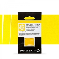
Daniel Smith Extra Fine Watercolor Half Pan - Cadmium Yellow Medium Hue
Cadmium Yellow Medium Hue, a mid- toned, slightly red yellow is perfect to add heat, energy and a focus in any painting. Mixed wet into wet with Cerulean Blue you will have a vast array of textured greens in various tones depending on the color balance and amounts of water, from dusky shadow greens to vibrant spring greens. It disperses beautifully in water for smooth, rich washes.
€11.70
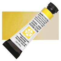
Daniel Smith Extra Fine Watercolor Tube 5ml - Aureolin Cobalt Yellow
The transparent non-staining properties of this cool yellow can effectively warm darker hues without affecting their transparency. Landscape artists often rely on Aureolin to successfully glaze their watercolors or as a light wash in underpainting, to add the appearance of sunshine. This pigment quality, along with the ability to lift and to create soft edges, makes Aureolin especially useful to portrait and floral painters as well.
€13.50
Daniel Smith Extra Fine Watercolor Tube 5ml - Cadmium Yellow Deep Hue
Cadmium Yellow Deep Hue – A rich, warm yellow with a golden glow. We’ve done it! Safe, Vibrant Cadmium Hue Watercolors! Our new formulas provide all the density and richness of classic cadmium colors. Our hues are virtually identical in color to their namesakes, but cleaner in mixtures and stronger in tints – you’ll find a little goes a long way. Working properties – staining power, semi-transparency and excellent light fastness – are also nearly identical to those of the low-soluble cadmium colors we previously offered.
€13.50
Daniel Smith Extra Fine Watercolor Tube 5ml - Hansa Yellow Medium
Hansa Yellow Medium is a high-tinting, organic pigment. Considered the ‘perfect yellow’, Hansa Yellow Medium offers more control when mixing. Painters admire the purity of this primary pigment and adjust its temperature while avoiding a gray from a hidden complement. Think of a yellow pepper.
€11.60
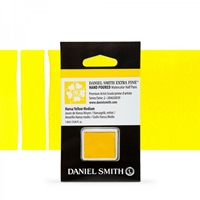
Daniel Smith Extra Fine Watercolor Half Pan - Hansa Yellow Medium
Hansa Yellow Medium is a high-tinting, organic pigment. Considered the ‘perfect yellow’, Hansa Yellow Medium offers more control when mixing. Painters admire the purity of this primary pigment and adjust its temperature while avoiding a gray from a hidden complement. Think of a yellow pepper.
€11.60
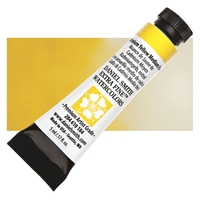
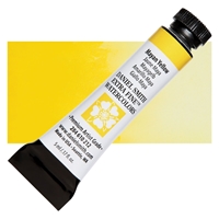
Daniel Smith Extra Fine Watercolor Tube 5ml - Mayan Yellow
Experience a saturated yellow with a rich history, you’ll love its transparency and smooth working properties. A natural looking yellow with a very slight green-brown cast – great for foliage highlights! This stunning watercolor revives the bold color used by the ancient Mayan people to adorn their murals and sculpture. Now using an eco-friendly process, with methods derived directly from the ancient Mayans, this unique, metal-free pigment is available to you. Its versatility, durability and exquisite hue will make it a color you’ll reach for again and again.
€13.50
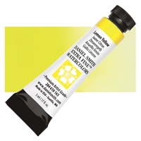
Daniel Smith Extra Fine Watercolor Tube 5ml - Lemon Yellow
Lemon Yellow, a brilliant primary yellow, is the perfect pigment for mixing a range of hues when a clean yellow is necessary. This saturated, bright color adds life to your work at full strength and washes out to a sweet soft glow for a light and subtle statement. You’ll enjoy the smooth handling properties and the durability of this extremely lightfast paint.
€9.90
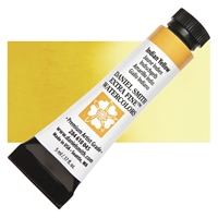
Daniel Smith Extra Fine Watercolor Tube 5ml - Indian Yellow
Don’t let the old line: made from the urine of cows fed an exclusive diet of mango leaves deter you from adding Indian Yellow to your palette; DANIEL SMITH’s vat pigmented Indian Yellow is a new formula. This medium to high tinting yellow lends a rusty orange edge to undisturbed puddles, a curious property when painting ripe fruit and vegetation. Autumn leaves and floral close-ups make great study subjects as you explore this pure chroma, ever so slightly granular yellow. Indian Yellow wets well and flows evenly.
€13.90
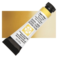
Daniel Smith Extra Fine Watercolor Tube 5ml - Naples Yellow
Naples Yellow will make you think of late Summer with it’s sunflowers, wheat fields and sunny, dry landscapes. This dusty yellow with a touch of Venetian Red is made a neutral semi-opaque with the addition of zinc oxide. More ideas for Naples Yellow would be dry yellow grasses easily brushstroked over painted fences and barns, the zinc oxide opacity aiding the Naples Yellow to show over darker colors.
€9.90
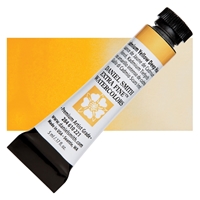
Daniel Smith Extra Fine Watercolor Tube 5ml - Hansa Yellow Deep
Kissed with a touch of orange, this is a pure chroma color with high-tinting, organic pigments. Hansa Yellow Deep is considered the ‘perfect yellow’, a fact which offers more control when mixing. Painters can admire the purity of this primary pigment and adjust its temperature while avoiding a gray from a hidden complement. Think of a yellow pepper.
€9.50
Daniel Smith Extra Fine Watercolor Half Pan - Hansa Yellow Deep
Kissed with a touch of orange, this is a pure chroma color with high-tinting, organic pigments. Hansa Yellow Deep is considered the ‘perfect yellow’, a fact which offers more control when mixing. Painters can admire the purity of this primary pigment and adjust its temperature while avoiding a gray from a hidden complement. Think of a yellow pepper.
€10.30
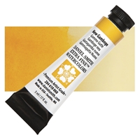
Daniel Smith Extra Fine Watercolor Tube 5ml - New Gamboge
Unlike other brands, DANIEL SMITH New Gamboge is an excellent lightfast formulation. It’s a transparent organic pigment from the yellow to orange zone of your color wheel. More staining than Yellow Ochre and equal in tinting ability to Raw Sienna. It’s a good substitute for those colors when transparency and non-granulation is desired while avoiding thick, muddy passages.
€9.90
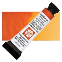
Daniel Smith Extra Fine Watercolor Tubes 5ml - Aussie Red Gold
DANIEL SMITH Aussie Red Gold is the rich, golden color of ochre cliffs set aflame at sunset. This brilliant, reddish gold will add glowing light to Autumn leaves, late summer flowers and landscapes. Australian Red Gold is transparent, non-granulating, low staining and performs wonderfully, you will love it on your palette!
€11.60
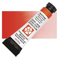
Daniel Smith Extra Fine Watercolor Tubes 5ml - Pyrrol Orange
This unforgettable semi-transparent/semi-opaque orange is a smooth, saturated and pure addition to the watercolorist’s palette. Capture the glory of a summer garden or the magic of a tropical sunset with this dynamic and versatile hue.
€11.60
Daniel Smith Extra Fine Watercolor Tube 5ml - Perinone Orange
Perinone Orange, with its vast range from vivid intensity to pale, transparent, fleshy washes, is a clear, clean vat pigment. From carrots to soft gladiola and azalea petals, this pure chroma orange is a treat for the eye and a dream to handle. Use in place of Cadmiums when mixing and revel in its glowing transparency. Play with salt texture and lift and squeegee techniques.
€13.50
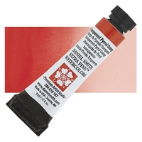
Daniel Smith Extra Fine Watercolor Tubes 5ml - Transparent Pyrrol Orange
This clear, dark, red-leaning orange thins into perfectly smooth washes. The color is vivid and warm, lovely used on its own, and great in mixes. Try it with granulating greens or blues to create exquisite earth colors and shadow-grays that are both textural and warm.
€11.60
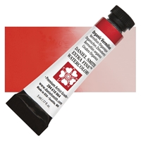
Daniel Smith Extra Fine Watercolor Tube 5ml - Organic Vermilion
This low-staining deep orange is sometimes called Scarlet Lake or Rose Carthame. Oranges can be very difficult to work with, but this one excels in handling and is a good option over Cadmium Orange.
€11.60
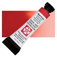
Daniel Smith Extra Fine Watercolor Tube 5ml - Mayan Orange
Mayan Orange is hot and intense. Use it straight from the tube for a blazing red-orange. As you add water, the color remains strong and disperses very evenly. Rich, bold colors adorned the murals and sculpture of the Mayan people. Even when exposed to centuries of severe heat and humidity, these colors have hardly faded over a thousand years. Now, using methods derived from ancient Mayan chemistry, these unique, metal-free pigments have been recreated using an eco-friendly process. The colors are smooth, non-granulating and semi-transparent. Their versatility, durability and exquisite hues make them colors you’ll reach for again and again.
€13.50
Daniel Smith Extra Fine Watercolor Tubes 5ml - Quinacridone Coral
A treat for the eyes of both painter and viewer, this intense Quinacridone color is a clear red tinged with pink and orange. Highly durable and extremely transparent, all the DANIEL SMITH Quinacridone colors excel in vivid clarity and intensity.
€11.60
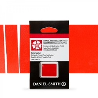
Daniel Smith Extra Fine Watercolor Half Pan - Pyrrol Scarlet
Pyrrol Scarlet is permanent, semi-transparent to semi-opaque and medium staining, this fire engine red is cleaner than Cadmium or Permanent Red. It is a modern synthetic-organic pigment. While close in value to its Perylene cousin, it disperses more evenly and is less granular.
€11.70
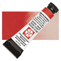
Daniel Smith Extra Fine Watercolor Tube 5ml - Pyrrol Scarlet
Permanent, semi-transparent to semi-opaque and medium staining, this fire engine red is cleaner than Cadmium or Permanent Red. It is a modern synthetic-organic pigment. While close in value to its Perylene cousin, it disperses more evenly and is less granular.
€13.50
Daniel Smith Extra Fine Watercolor Tube 5ml - Cadmium Red Medium Hue
Cadmium Red Medium Hue – A true stop sign red, an essential color for any palette. We’ve done it! Safe, Vibrant Cadmium Hue Watercolors! Our new formulas provide all the density and richness of classic cadmium colors. Our hues are virtually identical in color to their namesakes, but cleaner in mixtures and stronger in tints – you’ll find a little goes a long way. Working properties – staining power, semi-transparency and excellent light fastness – are also nearly identical to those of the low-soluble cadmium colors we previously offered.
€13.50
Daniel Smith Extra Fine Watercolor Tube 5ml - Pyrrol Red
This fire engine red is cleaner than Cadmium or Permanent Red. It is a modern synthetic-organic pigment. While close in value to its cousins the Perylenes, it disperses more evenly and is less granular.
€13.50
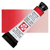
Daniel Smith Extra Fine Watercolor Tube 5ml - Perylene Red
Perylene Red is medium staining and semi-tranparent. It creates vivid, dark washes with a clean brilliant red-orange. This sedimentary pigment offers an additional health plus, as it is made from a metal-free red. Clean modern pigments such as this will put accidental mud-making in the past.
€13.50
Daniel Smith Extra Fine Watercolor Tubes 5ml - Quinacridone Red
A true, pure medium-staining red. Drop Naples Yellow into Quinacridone Red and create a peach, or paint dry brushstrokes onto apples. Highly durable and extremely transparent, all the DANIEL SMITH Quinacridone colors excel in vivid clarity and intensity.When the last batch of single pigment Quinacridone Gold was produced (the manufacturer of PO 49 had stopped making this pigment and allowed us to purchase all their remaining available stock, which lasted 17 years), we developed this new blend of PO 48 and PY 150 pigments. As you can see by the blending comparison below, it’s a gorgeous match!
€11.60
Daniel Smith Extra Fine Watercolor Tube 5ml - Alizarin Crimson
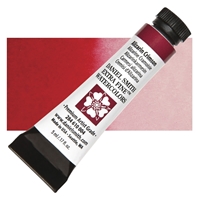
Alizarin Crimson is the oldest synthetic deep red-crimson pigment. It is a lake pigment which when applied in strength and kept from the direct sunlight will last for many decades. Alizarin is a treat to paint with, just the sheer joy of the depth and uniqueness of color is invigorating. A beautiful bluish-red pigment from the staining family, Alizarin Crimson is listed on the basic palette of a vast majority of artists. Intense and dark in value, Alizarin Crimson mixes cleanly with most pigments to create dark mixtures and warm neutrals. A combination of Aureolin (Cobalt Yellow) and French Ultramarine with Alizarin renders a surprising range of other colors resembling everything from Burnt Sienna and Umber to Payne’s Gray, while Alizarin Crimson with French Ultramarine creates an intense purple.
€9.90
Daniel Smith Extra Fine Watercolor Tubes 5ml - Permanent Alizarin Crimson
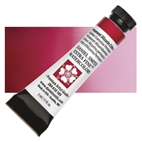
Permanent Alizarin Crimson, developed with our customers, blends pigments to produce an exceptionally lightfast red with true Alizarin Crimson character and versatility. Like classic Alizarin, it is vibrant, medium staining and very transparent, with the undeniable advantage of permanence. Try a rich and bold application or a blush of crimson color in a light wash, we know you’ll love this beautiful shade.
€11.60
Daniel Smith Extra Fine Watercolor Half Pan - Permanent Alizarin Crimson
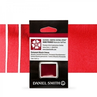
Permanent Alizarin Crimson blends pigments to produce an exceptionally lightfast red with true Alizarin Crimson character and versatility. Like classic Alizarin, it is vibrant, medium staining and very transparent, with the undeniable advantage of permanence. Try a rich and bold application or a blush of crimson color in a light wash, we know you’ll love this beautiful shade.
€11.50
Daniel Smith Extra Fine Watercolor Tube 5ml - Rhodonite Genuine
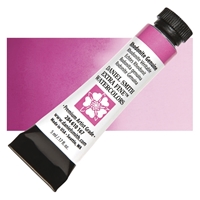
Made from jewelry-quality stone, this versatile rose pink is wonderful for portraits and landscapes. Used wet into wet, it creates a soft, transparent glow, without granulation. At full value, it is more intense but still transparent, low-staining and non-granulating.
€11.60
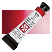
Daniel Smith Extra Fine Watercolor Tube 5ml - Carmine
Darker and more staining than Alizarin Crimson, and vastly superior in permanence, Carmine is also redder. This staining pigment, rich and intense, will retain its luminosity in dark passages, but will dilute to produce subtle tones without reducing its permanence. Darkest of the reds, Carmine will help you achieve clear neutrals when mixed with its complement, Phthalo Green.
€11.60
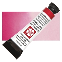
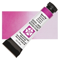
Daniel Smith Extra Fine Watercolor Tube 5ml - Opera Pink
The most vivid of all pinks, has long been requested by DANIEL SMITH customers. A primary magenta with a hint of fluorescent pink granulation producing some of the most brilliant glowing mixes you have ever seen. Try mixing Opera Pink with our New Gamboge for fiery oranges or with an Indanthrone Blue for stunning violets and glowing purples.
€9.90
Daniel Smith Extra Fine Watercolor Tube 5ml - Quinacridone Pink
Quinacridone Pink is a precise, perfect low-staining pink. Try with Indigo for deep dusty purples, or Indanthrone Blue for rich, clear purples. Quinacridone Pink can be mixed with Quinacridone Sienna or Burnt Orange in dilute wash states to create flesh tones or convincing sunsets. Highly durable and extremely transparent, all the DANIEL SMITH Quinacridone colors excel in vivid clarity and intensity.
€11.60
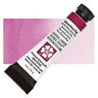
Daniel Smith Extra Fine Tubes 5ml - Quinacridone Rose
Quinacridone Rose, with its red-violet color, lends itself to fabulous purples. Try with Indigo for deep dusty purples, or Indanthrone Blue for rich, clear purples. Quinacridone Rose can be mixed with Quinacridone Sienna or Burnt Orange in dilute wash states to create fleshtones or convincing sunsets. Highly durable and extremely transparent, all the DANIEL SMITH Quinacridone colors excel in vivid clarity and intensity.
€11.60
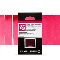
Daniel Smith Extra Fine Watercolor Half Pan - Quinacridone Rose
Quinacridone Rose, with its red-violet color, lends itself to fabulous purples. Try with Indigo for deep dusty purples, or Indanthrone Blue for rich, clear purples. Quinacridone Rose can be mixed with Quinacridone Sienna or Burnt Orange in dilute wash states to create fleshtones or convincing sunsets. Highly durable and extremely transparent, all the DANIEL SMITH Quinacridone colors excel in vivid clarity and intensity.
€11.50
Daniel Smith Extra Fine Watercolor Tubes 5ml - Quinacridone Magenta
This deep red violet disperses evenly and moves from deep darks to clear, glowing washes. Like all Quinacridone, it is an extremely lightfast organic pigment. In terms of complementary couples Quinacridone Magenta works especially well with yellow greens. Highly durable and extremely transparent, all the DANIEL SMITH Quinacridone colors excel in vivid clarity and intensity.
When the last batch of single pigment Quinacridone Gold was produced (the manufacturer of PO 49 had stopped making this pigment and allowed us to purchase all their remaining available stock, which lasted 17 years), we developed this new blend of PO 48 and PY 150 pigments. As you can see by the blending comparison below, it’s a gorgeous match!
€11.60
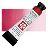
Daniel Smith Extra Fine Watercolor Tubes 5ml - Pyrrol Crimson
Living in a luxurious state between magenta and fuchsia, Pyrrol Crimson is a delicious red just begging to find its way into your rose garden. Moderately staining and semi-transparent, this pigment allows itself to be directed in a wash without running wild. It blends to an earthier rose when mixed with English Red Ochre and thins to a pale fuchsia rose when diluted.
€11.60
Daniel Smith Extra Fine Watercolor Tubes 5ml - Quinacridone Violet
A deep, reddish violet, Quin Violet disperses evenly with slight granulation and moves from deep darks to clear, glowing washes. Like all Quinacridones, it is an extremely lightfast organic pigment. In terms of complementary couples, Quinacridone Violet mixes best with a cleaner primary green. Highly durable and extremely transparent, all the DANIEL SMITH Quinacridone colors excel in vivid clarity and intensity.
€11.60
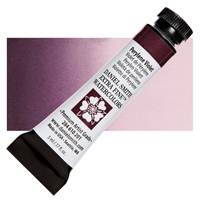
Daniel Smith Extra Fine Watercolor Tube 5ml - Perylene Violet
A deep, luscious, grape-juicy reddish-violet. The masstone is dark and intense, shifting in tints toward a rich red violet with a brownish-purple cast. Because of its relative neutrality, it’s a natural-looking choice for portrait, landscape or botanical work-imagine how good it looks with complementary greens. It also makes strong, interesting shadows.
€13.50
Daniel Smith Extra Fine Watercolor Tube 5ml - Cobalt Violet
Cobalt Violet embodies the softness of flower petals with its slightly granulating texture and lustrous finish. With a truly transparent quality, this light purple radiates in light washes. The delicate pigment comes alive at full strength and, because it is completely non-staining, highlights can be added, and strokes reworked. Cobalt Violet’s ability to create soft edges, to lift and to mix readily makes it a valuable contribution to watercolor palettes.
€13.50
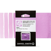
Daniel Smith Extra Fine Watercolor Half Pan - Wisteria
Like the blooms of its namesake flowering vine, Wisteria is a delicate, red-leaning lavender. Similar in color to Ultramarine Red but with different properties, this non-granulating and non-staining color paints smoothly and lifts easily. Wonderful for painting orchids and other florals.
€14.50
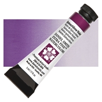
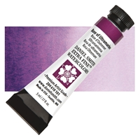
Daniel Smith Extra Fine Watercolor Tube 5ml - Rose of Ultramarine
This exciting blend mixes Quinacridone Rose and Ultramarine Blue. The blue settles as the rose floats, creating a vibrant, dimensional purple. For those artist artists who always mix their own purples, this unique, otherwise unattainable separation is worth exploring. Juxtapose Rose of Ultramarine with pure Phthalo Blue for fun and effect.
€9.90
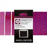
Daniel Smith Extra Fine Watercolor Half Pan - Rose of Ultramarine
This exciting blend mixes Quinacridone Rose and Ultramarine Blue. The blue settles as the rose floats, creating a vibrant, dimensional purple. For those artist artists who always mix their own purples, this unique, otherwise unattainable separation is worth exploring. Juxtapose Rose of Ultramarine with pure Phthalo Blue for fun and effect.
€10.50
Daniel Smith Extra Fine Watercolor Tubes 5ml - Quinacridone Purple
Quinacridone Purple is a rich, powerful and juicy purple with a slight reddish cast. It’s non-granulating, so washes are smooth and controlled and it mixes beautifully. A luscious, versatile color. Quinacridone watercolors flow beautifully for extremely smooth washes, have incredible depth of color and can be lifted easily while still wet. They’re exceptionally strong yet transparent, ideal for glazing. Understandably, they’ve been very popular colors since their introduction – people just love them!
€11.60
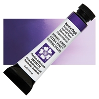
Daniel Smith Extra Fine Watercolor Tube 5ml - Imperial Purple
Unlock a wealth of color with this princely pigment. Rich in texture, this highly saturated purple will granulate to reveal shades of plum and ultramarine. From the deepest purple, this semi-transparent and low-staining pigment continues to deliver as it is applied in ever more delicate washes to the palest lavender. Give a stand of garden Irises the royal treatment or kiss the sunset with the softest touch. This regal pigment is palette royalty.
€11.60
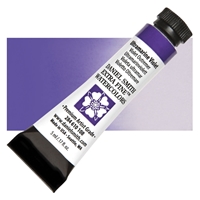
Daniel Smith Extra Fine Watercolor Tube 5ml - Ultramarine Violet
Ultramarine Blue pigment is baked to create Ultramarine Violet. It is an excellent lightfast pigment that flows freely, leaving slight granulation in washes. Ultramarine Violet is also low-staining. Mist damp passages of either pigment for a delightful mottled effect.
€9.90
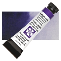
Daniel Smith Extra Fine Watercolor Tubes 5ml - Amethyst Genuine
Oh my goodness – it’s beautiful! exclaimed one of our testers, and it is. Amethyst Genuine is a rich, true purple – it’s almost black in masstone and capable of infinite gradation. Although it is a granulating color, it can also make lovely clear washes with just the barest hint of sparkle from the crushed gemstone.
€14.90
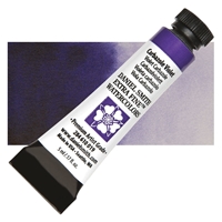
Daniel Smith Extra Fine Watercolor Tube 5ml - Carbazole Violet
This slightly granular blue-violet is an intense, vibrant color with medium staining properties. A brushstroke of concentrated Carbazole Violet onto dry paper moves the pigment from black-violet to clear purple and can invent an iris petal with each stroke. Add Indigo to Carbazole Violet, along with Quinacridone Rose or Anthraquinoid Red. Blot, squeegee and incise damp passages to created veins, variegated passages and highlights.
€11.60
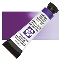
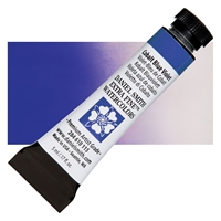
Daniel Smith Extra Fine Watercolor Tube 5ml - Cobalt Blue Violet
A brilliant purple with remarkable blue undertones and a granulating texture. Try mixing this bold color with Prussian Green for surprisingly soft blue hues. At full strength, this violet is dark enough for deep twilight shadows. Mix with water and a range of tones are revealed. A graceful addition to the watercolorists’ palette, this is the perfect purple for dynamic floral paintings.
€13.50
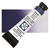
Daniel Smith Extra Fine Watercolor Tube 5ml - Moonglow
Water frees this amazing three-pigment blend to perform miracles. Watch and wait as Anthraquinoid Red floats, Ultramarine Blue settles and Viridian grays the resulting violet color. Selectively blot and lift a surface wash to expose delicate blue-greens. A description of the fascinating light and dark washes can never match a personal experience! Use Moonglow in shadows and as a silhouette pigment and enjoy its reaction to salt application in background washes. Its neutral tinting property makes it effective with almost all the DANIEL SMITH watercolors. Try introducing the Luminescent Interference pigments to areas of wet, damp or dry Moonglow. Look to Undersea Green as a companion pigment. And try a Moonglow sky and long shadows on sunset snow scenes.
€11.60
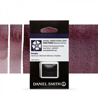
Daniel Smith Extra Fine Watercolor Half Pan - Moonglow
Water frees this amazing three-pigment blend to perform miracles. Watch and wait as Anthraquinoid Red floats, Ultramarine Blue settles and Viridian grays the resulting violet color. Selectively blot and lift a surface wash to expose delicate blue-greens. A description of the fascinating light and dark washes can never match a personal experience! Use Moonglow in shadows and as a silhouette pigment and enjoy its reaction to salt application in background washes. Its neutral tinting property makes it effective with almost all the DANIEL SMITH watercolors. Try introducing the Luminescent Interference pigments to areas of wet, damp or dry Moonglow. Look to Undersea Green as a companion pigment. And try a Moonglow sky and long shadows on sunset snow scenes.
€14.50
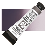
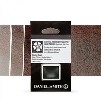
Daniel Smith Extra Fine Watercolor Tubes 5ml - Shadow Violet
A smooth gray-mauve in light washes, Shadow Violet displays a fascinating granulation when used more thickly. Deep warm violet in mass tone, it reveals a slight orange glow in thin applications. Its transparency makes it a great choice for glazing and it’s ideal, of course, for conveying the subtleties of shadows.
€11.60
Daniel Smith Extra Fine Watercolor Half Pan - Shadow Violet
A smooth gray-mauve in light washes, Shadow Violet displays a fascinating granulation when used more thickly. Deep warm violet in mass tone, it reveals a slight orange glow in thin applications. Its transparency makes it a great choice for glazing and it’s ideal, of course, for conveying the subtleties of shadows.
€11.90
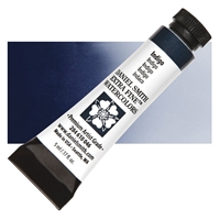
Daniel Smith Extra Fine Watercolor Tube 5ml - Indigo
DANIEL SMITH Indigo formula mixes Indanthrone Blue with Lamp Black for an extremely lightfast, intense dark that closely matches true Indigo. Transparent, yet high in tinting strength, this Indigo leaves a gentle faded blue denim stain when blotted from a damp state paint. Blueberries, blackberries and plums are a few subjects to play with using this technique. Use Indigo wherever dusty purples are desired. Indigo evokes a feeling of atmospheric depth used for expressive, moody skies.
€9.90


