You have no items in your shopping cart.
- JUST ARRIVED
-
BASIC SUPPLIES
- TRANSFERS & RUB-ONS
- STORAGE
- RESIN & LIQUID GLASS
- PRIMERS & MEDIUMS
- GEL MEDIUMS
- MODELLING PASTE
- VARNISH & SEALERS
- SUBSTRATES
-
TOOLS
- Scissors & Cutters
- Trimmers
- Scoring Boards & Punch Boards
- Punches
- Power Tools
- Miscellaneous Tools
- Gelli Plates
- Brayers
- Magnets
- Rulers
- Bone Folders
- Machines
- Acrylic Blocks for Stamps
- Tweezers & Spatulas
- Artist Tapes
- Stylus & Picks
- Maintenance & Cleaning
- Color Wheels
- Bottles
- Craft Mats
- Needles
- Photo Backdrops
- PENCILS - CHARCOAL
- MARKERS - PENS
- ΜΕΛΑΝΙ & ΠΕΝΕΣ
-
INKS
- Tools
- Tim Holtz Distress Inks
- SIMON HURLEY create.
- Tsukineko VersaFine Clair
- Ranger Archival Inks
- Alcohol Inks
- Tsikuneko Versacolor Mini
- Tsikuneko VersaCraft Mini
- Embossing Inks
- Hybrid Inks
- Metallic Inks
- Hero Art Inks
- Liquid Inks
- Studio Light Essentials
- Screen Printing Inks
- Block Printing Inks
- PinkFresh Studio Inks
- Tsukineko StazOn
- ΠΗΛΟΣ - ΚΑΛΟΥΠΙΑ
- PATINAS
- BRUSHES
- GLUES & ADHESIVES
- PIGMENTS - GLITTER - MICAS
- STENCILS
- STAMPS
- STAMP & DIE SETS
- STATIONARY
- PAINTS
- PACKAGING
-
SCRAPBOOKING
- BY COLLECTION
- SCRAPBOOKING KITS
- SCRAPBOOKING PAPER
- ALBUMS & ACCESSORIES
- CARD MAKING ACCESSORIES
- ΔΙΑΚΟΣΜΗΤΙΚΑ
- JOURNALING CARDS
- FUSSY CUTTING
- GLUES
- EMBOSSING & DIE CUTTING
- BETTERPRESS LETTERPRESS SYSTEM
- EMBOSSING POWDERS
- TOOLS
- STORAGE
- FLOWER MAKING
- GLITTER, MICAS & PEARLS
- STAMP & DIE SETS
- STAMPS & ACCESSORIES
- ΜΕΛΑΝΙΑ
- Shrink Plastic
- TRAVELERS NOTEBOOKS
- JUNK JOURNALING
-
CRAFTS & HOBBIES
- HOME DECOR - GIFT IDEAS
- PRINTMAKING
- SHRINK PLASTIC
- CALLIGRAPHY & LETTERING
- MARBLING
- MAKRAME
- BOOKS
- HANDMADE PAPER CRAFTING
- WAX ART
- FLOWER MAKING
- COSPLAY, COSTUMING & FACE PAINTING
- DECOUPAGE
- DO IT YOURSELF (DIY)
- FOILING
- POURING
- QUILLING
- BOOKFOLDING
- BOOKBINDING
- LEATHER CRAFTS
- ΚΟΣΜΗΜΑ
- IMAGE TRANSFER
- RESINS - LIQUID GLASS
- ΥΦΑΣΜΑ
- GLASS PAINTS
-
MIXED MEDIA
- COLLAGE PAPERS
- TRANSFERS & RUB-ONS
- ALCOHOL INK ART
- GEL MEDIUMS
- GELLI PLATES
- ACRYLIC MEDIUMS
- SURFACES
- STENCILS
- WATERCOLOR
- ΒΕΡΝΙΚΙΑ - SEALERS
- ALTERABLES
- EPHEMERA PACKS
- TEXTURES - CRACKLES
- CRAYONS
- PREPARATION
- STAMP & DIE SETS
- STAMPS
- SPRAYS & MISTS
-
ACRYLICS
- DecoArt Dazzling Metallics
- Americana Acrylics Large
- Americana Matte Metallics
- DecoArt Stylin Fashion Acrylic
- Paint Packs
- Americana Pearl Acrylics
- DecoArt Silk Acrylics
- Dylusions Acrylic Paints
- Americana Acrylics
- Americana Premium Acrylics
- MEDIA FLUID ACRYLICS
- DecoArt Traditions
- Dimensional Paint & Writers
- ΜΑΡΚΑΔΟΡΟΙ & ΜΟΛΥΒΙΑ
- ΜΕΛΑΝΙΑ
- PIGMENTS / MICA POWDERS
- PLANNERS
- SIGNATURE LINES
- SEASONAL
Categories
- JUST ARRIVED
- NEW PRODUCTS
-
BASIC SUPPLIES
- TRANSFERS & RUB-ONS
- STORAGE
- RESIN & LIQUID GLASS
- PRIMERS & MEDIUMS
- GEL MEDIUMS
- MODELLING PASTE
- VARNISH & SEALERS
- SUBSTRATES
-
TOOLS
- Scissors & Cutters
- Trimmers
- Scoring Boards & Punch Boards
- Punches
- Power Tools
- Miscellaneous Tools
- Gelli Plates
- Brayers
- Magnets
- Rulers
- Bone Folders
- Machines
- Acrylic Blocks for Stamps
- Tweezers & Spatulas
- Artist Tapes
- Stylus & Picks
- Maintenance & Cleaning
- Color Wheels
- Bottles
- Craft Mats
- Needles
- Photo Backdrops
- PENCILS - CHARCOAL
- MARKERS - PENS
- ΜΕΛΑΝΙ & ΠΕΝΕΣ
-
INKS
- Tools
- Tim Holtz Distress Inks
- SIMON HURLEY create.
- Tsukineko VersaFine Clair
- Ranger Archival Inks
- Alcohol Inks
- Tsikuneko Versacolor Mini
- Tsikuneko VersaCraft Mini
- Embossing Inks
- Hybrid Inks
- Metallic Inks
- Hero Art Inks
- Liquid Inks
- Studio Light Essentials
- Screen Printing Inks
- Block Printing Inks
- PinkFresh Studio Inks
- Tsukineko StazOn
- ΠΗΛΟΣ - ΚΑΛΟΥΠΙΑ
- PATINAS
- BRUSHES
- GLUES & ADHESIVES
- PIGMENTS - GLITTER - MICAS
- STENCILS
- STAMPS
- STAMP & DIE SETS
- STATIONARY
-
PAINTS
- Paint Packs
- Home Decor Paints
- Dimensional Paint & Writers
-
Acrylic Paints
- DecoArt Silk
- Americana Acrylics Large Packs
- Americana Pearls
- Art By Marlene Acrylic Sets
- DecoArt Wax Effects
- Acrylic Mediums
- DecoArt Americana Acrylics
- DecoArt Americana Premium Acrylic Paint
- DecoArt Traditions
- DecoArt Media Fluid Acrylics
- Dylusions Acrylic Paints
- Neons & Black Light
- DecoArt Americana Glow In The Dark
- DecoArt Black Light Neon Paint
- Metallic Paints
- Watercolor
- Sprays & Mists
- Color Wheels
- Fabric Paints & Dyes
- PACKAGING
-
SCRAPBOOKING
-
BY COLLECTION
- Esprit de Voyage
- Simple Vintage Holly Jolly
- Family
- Cottagecore
- See You In Paris
- By The Lake
- Academia
- Lullaby Lane
- Thankful & Blessed
- Marry Me
- Merry & Bright
- Birdsong
- Baking Spirits Bright
- Nutcracker Christmas
- From the North Pole
- A Vintage Christmas
- 25 & Peppermint
- Vintage Halloween
- Santa's Village
- Snow Pine Lodge
- Sweater Weather
- The Nutcracker
- Halloween Fun
- Simple Vintage Scary Stories
- Cider & Donuts
- Spooktacular Halloween
- Merry & Bright
- Autumn Greetings
- Jingle All The Way
- Christmas Rose
- Whimsical Christmas
- Paris Je T'aime
- Autumn Splendor
- In My Craftroom
- Christmas Blessings
- Merry & Joy
- 49 & Market Academia
- Happy Healing
- Urban Jungle
- Nature Academia
- Honeysuckle
- Krafty Garden
- ENCHANTED OCEAN
- Summer Snapshots
- Sunshine On My Mind
- Flight Of Fancy
- Pack Your Bags
- Good Life Bliss
- Off To School
- Dreamland
- Just Beachy
- Bunny Hop
- The Simple Things
- Sweet Little Princess
- From The Past
- Special Things
- Here Comes Easter
- In Full Bloom
- Here Comes Spring
- Baby Girl
- Victorian Dreams
- The Beach Is Calling
- Nature's Garden - Hydrangea
- Smitten
- The Great Outdoors
- Special Delivery Baby Girl
- Special Delivery Baby Boy
- Special Delivery Baby
- Wherever
- Floral Elegance
- Hello Little Girl
- Hello Little Boy
- Simple Vintage Spring Garden
- Traveller
- Playtime
- Sweet Rush
- Always & Forever
- Nature's Garden - Kingfisher
- April & Ivy
- Cool Girl
- Cool Boy
- Fresh Air
- True Colors
- Remember
- Cute & Crafty
- Discover + Create
- Make A Wish Birthday Boy
- 4 Seasons
- Timeless Memories
- Make A Wish Birthday Girl
- Happy & Sweet
- Happy Things
- Summer Things
- Fresh Things
- Baby Boy
- 52 Weeks
- Fairy Garden
- ARToptions Spice
- Love Notes
- In The Moment
- Bohemian Heart
- Winter Wonder
- Wintertime
- Good To Be Home
- Sugarplum Wishes
- At home
- Gingerbread Kisses
- White Christmas
- Peppermint Kisses
- Happy Holidays
- Letters to Santa
- A Wonderful Christmas
- Mittens & Mistletoe
- Evergreen & Holly
- Simple Vintage Dear Santa
- Simple Vintage Tis The Season
- Christmas Market
- Peace and Joy
- The Holiday Life
- Boho Christmas
- Christmas Spectacular
- Have A Holly Jolly Christmas
- ART OPTIONS - HOLIDAY WISHES
- Twelve Days Of Christmas
- What's Cookin'?
- Christmas Time
- Year In Review
- Noteworthy
- Wedding Bells
- Lost In Wonderland
- Bohemian Wedding
- Happy Birthday
- My Happy Place
- All Hallows Eve
- Sweet & Spooky
- FaBOOlous
- Acorn Lane
- ARToptions Spice
- Autumn Bouquets
- Hello Again
- Vintage Artistry, Nature Study
- Monster Mash
- Happy Crafting
- Halloween
- Sweet Sunshine
- Travelogue
- Serendipity
- School Days
- Peony Garden
- Antique Shop
- Wizards And Company
- Dino-Mite
- Pirates
- Simple Vintage Essentials
- Trail Mix
- The Little Things
- Book Lover
- Pretty Kitty
- Doggone Cute
- Postcards from Paradise
- PS. I Love You
- Make a Splash
- Vintage Artistry Everywhere
- VINTAGE ARTISTRY - NATURALIST
- Seaside Summer
- Color Swatch: Inkwell
- Graphic 45 Little One
- Spectrum Gardenia
- Garden Bouquet
- Our Baby
- Hello Lovely
- Here Comes the Sun
- Sunkissed
- Set Sail
- Bee Happy
- Simple Stories Boho Sunshine
- Gingham Garden
- Here + There
- Sandy Paws
- Let's Go Travel
- Places We Go
- Her Story
- Nana's Kitchen
- Mediterranean Heaven
- Retro Summer
- Where To Next?
- Once Upon A Time
- Here, There and Everywhere
- Hello Pink Autumn
- Simple Vintage October 31st
- SCRAPBOOKING KITS
- SCRAPBOOKING PAPER
- ALBUMS & ACCESSORIES
- CARD MAKING ACCESSORIES
- ΔΙΑΚΟΣΜΗΤΙΚΑ
- JOURNALING CARDS
- FUSSY CUTTING
- GLUES
- EMBOSSING & DIE CUTTING
- BETTERPRESS LETTERPRESS SYSTEM
- EMBOSSING POWDERS
- TOOLS
- STORAGE
- FLOWER MAKING
- GLITTER, MICAS & PEARLS
- STAMP & DIE SETS
- STAMPS & ACCESSORIES
- ΜΕΛΑΝΙΑ
- Shrink Plastic
- TRAVELERS NOTEBOOKS
- JUNK JOURNALING
-
BY COLLECTION
-
CRAFTS & HOBBIES
- HOME DECOR - GIFT IDEAS
- PRINTMAKING
- SHRINK PLASTIC
- CALLIGRAPHY & LETTERING
- MARBLING
- MAKRAME
- BOOKS
- HANDMADE PAPER CRAFTING
- WAX ART
- FLOWER MAKING
- COSPLAY, COSTUMING & FACE PAINTING
- DECOUPAGE
- DO IT YOURSELF (DIY)
- FOILING
- POURING
- QUILLING
- BOOKFOLDING
- BOOKBINDING
- LEATHER CRAFTS
- ΚΟΣΜΗΜΑ
- IMAGE TRANSFER
- RESINS - LIQUID GLASS
- ΥΦΑΣΜΑ
- GLASS PAINTS
-
MIXED MEDIA
- COLLAGE PAPERS
- TRANSFERS & RUB-ONS
- ALCOHOL INK ART
- GEL MEDIUMS
- GELLI PLATES
- ACRYLIC MEDIUMS
- SURFACES
- STENCILS
- WATERCOLOR
- ΒΕΡΝΙΚΙΑ - SEALERS
- ALTERABLES
- EPHEMERA PACKS
- TEXTURES - CRACKLES
- CRAYONS
- PREPARATION
- STAMP & DIE SETS
- STAMPS
- SPRAYS & MISTS
-
ACRYLICS
- DecoArt Dazzling Metallics
- Americana Acrylics Large
- Americana Matte Metallics
- DecoArt Stylin Fashion Acrylic
- Paint Packs
- Americana Pearl Acrylics
- DecoArt Silk Acrylics
- Art By Marlene Acrylic Sets
- Dylusions Acrylic Paints
- DecoArt Wax Effects
- Neons & Black Light
- Americana Acrylics
- Americana Premium Acrylics
- DecoArt Americana Glow In The Dark
- DecoArt Black Light Neon Paint
- MEDIA FLUID ACRYLICS
- DecoArt Traditions
- Dimensional Paint & Writers
- ΜΑΡΚΑΔΟΡΟΙ & ΜΟΛΥΒΙΑ
- ΜΕΛΑΝΙΑ
- PIGMENTS / MICA POWDERS
- PLANNERS
- SIGNATURE LINES
- GIFT CARDS
- SEASONAL
- JUST ARRIVED
-
BASIC SUPPLIES
- Scissors & Cutters
- Trimmers
- Scoring Boards & Punch Boards
- Punches
- Power Tools
- Miscellaneous Tools
- Gelli Plates
- Brayers
- Magnets
- Rulers
- Bone Folders
- Machines
- Acrylic Blocks for Stamps
- Tweezers & Spatulas
- Artist Tapes
- Stylus & Picks
- Maintenance & Cleaning
- Color Wheels
- Bottles
- Craft Mats
- Needles
- Photo Backdrops
- View all
- Tools
- Tim Holtz Distress Inks
- SIMON HURLEY create.
- Tsukineko VersaFine Clair
- Ranger Archival Inks
- Alcohol Inks
- Tsikuneko Versacolor Mini
- Tsikuneko VersaCraft Mini
- Embossing Inks
- Hybrid Inks
- Metallic Inks
- Hero Art Inks
- Liquid Inks
- Studio Light Essentials
- Screen Printing Inks
- Block Printing Inks
- PinkFresh Studio Inks
- Tsukineko StazOn
-
SCRAPBOOKING
-
CRAFTS & HOBBIES
-
MIXED MEDIA
- DecoArt Dazzling Metallics
- Americana Acrylics Large
- Americana Matte Metallics
- DecoArt Stylin Fashion Acrylic
- Paint Packs
- Americana Pearl Acrylics
- DecoArt Silk Acrylics
- Dylusions Acrylic Paints
- Americana Acrylics
- Americana Premium Acrylics
- MEDIA FLUID ACRYLICS
- DecoArt Traditions
- Dimensional Paint & Writers
- PLANNERS
-
SIGNATURE LINES
- SEASONAL
Menu
- JUST ARRIVED
-
BASIC SUPPLIES
- back
- TRANSFERS & RUB-ONS
- STORAGE
- RESIN & LIQUID GLASS
- PRIMERS & MEDIUMS
- GEL MEDIUMS
- MODELLING PASTE
- VARNISH & SEALERS
- SUBSTRATES
- TOOLS
- PENCILS - CHARCOAL
- MARKERS - PENS
- ΜΕΛΑΝΙ & ΠΕΝΕΣ
- INKS
- ΠΗΛΟΣ - ΚΑΛΟΥΠΙΑ
- PATINAS
- BRUSHES
- GLUES & ADHESIVES
- PIGMENTS - GLITTER - MICAS
- STENCILS
- STAMPS
- STAMP & DIE SETS
- STATIONARY
- PAINTS
- PACKAGING
-
SCRAPBOOKING
- back
- BY COLLECTION
- SCRAPBOOKING KITS
- SCRAPBOOKING PAPER
- ALBUMS & ACCESSORIES
- CARD MAKING ACCESSORIES
- ΔΙΑΚΟΣΜΗΤΙΚΑ
- JOURNALING CARDS
- FUSSY CUTTING
- GLUES
- EMBOSSING & DIE CUTTING
- BETTERPRESS LETTERPRESS SYSTEM
- EMBOSSING POWDERS
- TOOLS
- STORAGE
- FLOWER MAKING
- GLITTER, MICAS & PEARLS
- STAMP & DIE SETS
- STAMPS & ACCESSORIES
- ΜΕΛΑΝΙΑ
- Shrink Plastic
- TRAVELERS NOTEBOOKS
- JUNK JOURNALING
- View all
-
CRAFTS & HOBBIES
- back
- HOME DECOR - GIFT IDEAS
- PRINTMAKING
- SHRINK PLASTIC
- CALLIGRAPHY & LETTERING
- MARBLING
- MAKRAME
- BOOKS
- HANDMADE PAPER CRAFTING
- WAX ART
- FLOWER MAKING
- COSPLAY, COSTUMING & FACE PAINTING
- DECOUPAGE
- DO IT YOURSELF (DIY)
- FOILING
- POURING
- QUILLING
- BOOKFOLDING
- BOOKBINDING
- LEATHER CRAFTS
- ΚΟΣΜΗΜΑ
- IMAGE TRANSFER
- RESINS - LIQUID GLASS
- ΥΦΑΣΜΑ
- GLASS PAINTS
-
MIXED MEDIA
- back
- COLLAGE PAPERS
- TRANSFERS & RUB-ONS
- ALCOHOL INK ART
- GEL MEDIUMS
- GELLI PLATES
- ACRYLIC MEDIUMS
- SURFACES
- STENCILS
- WATERCOLOR
- ΒΕΡΝΙΚΙΑ - SEALERS
- ALTERABLES
- EPHEMERA PACKS
- TEXTURES - CRACKLES
- CRAYONS
- PREPARATION
- STAMP & DIE SETS
- STAMPS
- SPRAYS & MISTS
- ACRYLICS
- ΜΑΡΚΑΔΟΡΟΙ & ΜΟΛΥΒΙΑ
- ΜΕΛΑΝΙΑ
- PIGMENTS / MICA POWDERS
- View all
- PLANNERS
- SIGNATURE LINES
- SEASONAL
Categories
DANIEL SMITH
For Daniel Smith, color is … everything! Extra Fine watercolor pans, beautiful Watercolor Sets make the artists go wild! Color has always been the main reason– to fill your palette with the beauty and the emotion that sets your imagination free!
Sort by
Display
per page
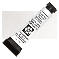
Daniel Smith Extra Fine Watercolor Tube 5ml - Titanium White
Create pastel shades with a creamy, semi-opaque/semi-transparent finish by mixing Titanium White with your favorite watercolor pigments. Although not opaque enough for full coverage, this watercolor can be used straight from the tube to add highlights or as a light wash over other colors for a soft veil of light tone. Excellent lightfastness and a smooth finish are hallmarks of this useful pigment.
€9.90
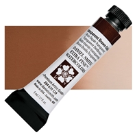
Daniel Smith Extra Fine Watercolor Tube 5ml - Transparent Brown Oxide
A fully transparent, non-staining, rich, vivid brown. Elemental and versatile, its granulating properties when blended with Permanent Green changes a sprout to a mature green of tenure and complexity. Used in a low ratio of paint to water in a wash, Transparent Brown Oxide becomes almost peach and can be used as a glaze with a remarkable effect adding shadows rich in depth and mystery.
€9.90
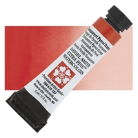
Daniel Smith Extra Fine Watercolor Tubes 5ml - Transparent Pyrrol Orange
This clear, dark, red-leaning orange thins into perfectly smooth washes. The color is vivid and warm, lovely used on its own, and great in mixes. Try it with granulating greens or blues to create exquisite earth colors and shadow-grays that are both textural and warm.
€11.60
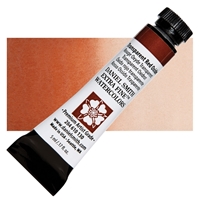
Daniel Smith Extra Fine Watercolor Tube 5ml - Transparent Red Oxide
A highly transparent burnt orange loves to mingle with the lamp black, settling in beneath it, mixing with it to create tones of cinnamon and tobacco. Fire seems to dance on the walls as its peach undertones nestle in with the black. Incredibly warm and non-staining, you can create stunning effects. Glaze it over the French Ochre for a warm fireside glow or layer it over itself for a rich and glowing red ochre that has no equal.
€9.90
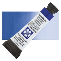
Daniel Smith Extra Fine Watercolor Tube 5ml - Ultramarine Blue
Ultramarine Blue plots cooler and bluer than the more saturated French Ultramarine. Temperature aside, both blues have equal permanence, lightfastness and transparency. Ultramarine Blue is slightly less granular in concentrated washes. For less saturation, sedimentation and cost, use Ultramarine Blue straight, for vibrant crayon-like color or mixed with a cool red for dark, effective neutrals.
€9.90
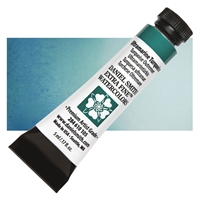
Daniel Smith Extra Fine Watercolor Tube 5ml - Ultramarine Turquoise
Transparent Ultramarine Turquoise is the granular, low-staining cousin of Phthalo Turquoise. Use it when less stain and more granulation is desired, and consider it for an interesting, non-traditional glaze.
€9.90
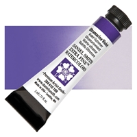
Daniel Smith Extra Fine Watercolor Tube 5ml - Ultramarine Violet
Ultramarine Blue pigment is baked to create Ultramarine Violet. It is an excellent lightfast pigment that flows freely, leaving slight granulation in washes. Ultramarine Violet is also low-staining. Mist damp passages of either pigment for a delightful mottled effect.
€9.90
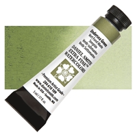
Daniel Smith Extra Fine Watercolor Tube 5ml - Undersea Green
An artist’s favorite, this exciting medium to high staining green blends French Ultramarine with Quinacridone Gold. The inorganic, sedimentary French Ultramarine settles and granulates while the organic, transparent Quinacridone Gold floats into a golden halo. Concentrated, this will remind you of warm sea kelp. Apply with Moonglow, Ultramarines and Quinacridone mixtures to color-coordinate and lend atmosphere to various passages. Undersea Green is beautiful touched damp or drybrushed with Interference Gold. Use Undersea green into autumn leaf paintings.
€9.90
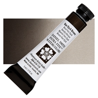
Daniel Smith Extra Fine Watercolor Tube 5ml - Van Dyck Brown
A deep, dark, lightfast mix of siennas and umbers, Van Dyck Brown has a special reticulating property ideal for texturing a wash. Moderate staining and semi-transparent, it works well in place of Sepia.
€9.90
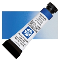
Daniel Smith Extra Fine Watercolor Tube 5ml - Verditer Blue
A true blue, a blue’s blue. Verditer Blue is an historical pigment with a place on every palette. Begin with a dark application, a deep azure lake, and watch how this slightly granulating paint travels quickly in water. Fade to the color of cornflowers and create surprising effects in a wash. Dilute it to the palest baby blue. Enjoy every nuance of this wonderful, semi-transparent watercolor.
€11.60
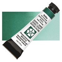
Daniel Smith Extra Fine Watercolor Tubes 5ml - Viridian
Seldom used at full tube strength, this transparent, non-staining pigment is an excellent glazing pigment and a portrait painter’s essential. It’s a cool blue-green useful in mixing without staining other pigment particles and for soft edges in florals. It is the secret hidden ingredient in Moonglow. Viridian can quickly modify reds, and in combination with the Quinacridones, its versatility has multiplied.
€11.60
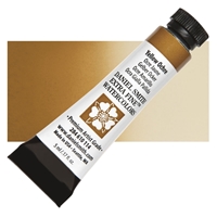
Daniel Smith Extra Fine Watercolor Tube 5ml - Yellow Ochre
Yellow Ochre works especially well with other transparent pigments. Try mixing transparent, medium-tinting Yellow Ochre with equally transparent, medium-tinting Viridian. Somewhat neutral, Yellow Ochre reacts beautifully with Cerulean Blue when spattered into the damp paint. While traditionally Yellow Ochres tend to be opaque or whitened in other brands, DANIEL SMITH Yellow Ochre is transparent, a property beloved by watercolorists!
€9.90
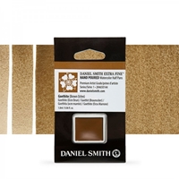
Daniel Smith Extra Fine Χρώμα Ακουαρέλας Half Pan - Goethite (Brown Ochre)
Found in iron deposits nearly worldwide, Goethite (Brown Ochre) is named after Johann Wolfgang Goethe, the German philosopher, poet and mineralogist. Our unusually pure pigment is mined in Russia, south of Moscow. Rich and warm, DANIEL SMITH Goethite is a dark tea color in masstone and washes out to a rich, warm tan. In washes, it displays intriguing granulation, with pools of light and dark in every brushstroke. Like all colors derived from the earth, it is lightfast and permanent – a lasting connection to the planet and the creative forces of nature.
€10.30
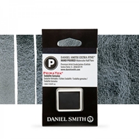
Daniel Smith Extra Fine Watercolor Half Pan - Sodalite Genuine
Sodalite, with a distinctive deep blue color is one of the components of Lapis Lazuli and very rare. DANIEL SMITH Sodalite is the finest quality and deepest blue that comes from Greenland and the flanks of Italy’s Mt. Vesuvius. In watercolor, the inky color of this semi precious stone granulates as it dries, layering a blue-black textural surface on a smooth blue-gray undertone. Low staining, lightfast and semi-tranparent, Sodalite creates a three-dimensional quality as it dries.
€15.50
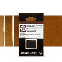
Daniel Smith Extra Fine Watercolor Half Pan - Wisteria
This rich dark brown earth pigment is popular with artists due to its semi- or semi-opaque qualities. It is lightfast, low-staining, and can readily be lifted to vary its value in otherwise dark passages. Warm Burnt Umber with a little Alizarin Crimson or cool it with blue as your subject dictates.
€12.90
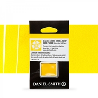
Daniel Smith Extra Fine Watercolor Half Pan - Cadmium Yellow Medium Hue
Cadmium Yellow Medium Hue, a mid- toned, slightly red yellow is perfect to add heat, energy and a focus in any painting. Mixed wet into wet with Cerulean Blue you will have a vast array of textured greens in various tones depending on the color balance and amounts of water, from dusky shadow greens to vibrant spring greens. It disperses beautifully in water for smooth, rich washes.
€11.70
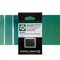
Daniel Smith Extra Fine Watercolor Half Pan - Cascade Green
The craggy peaks of the Cascade Mountains that divide lush, western Washington from the dry, high plains of the east, inspired this unique green. From damp evergreen forests, and alpine meadows to the drier, sunnier open forests, our Cascade Green showcases a million shades of green found in those environments becoming a versatile addition to our artist-preferred greens. As you brush it on, subtle variation from dark to light adds the illusion of depth. Straight from the tube, this rich, mid-range green is cool, dark and mossy. In washes, it has a stunning clarity. In any application, it has excellent lightfastness.
€12.90
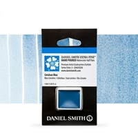
Daniel Smith Extra Fine Watercolor Half Pan - Cerulean Blue
A superb mixing color. Think of Cerulean Blue as a cleaner, brighter, and slightly warmer alternative to the Cerulean Blue Chromium. A bit less green, it’s a truer blue that will be a versatile component of any palette.
€15.80
Customer service
My account
Copyright © 2024 ScrapsnPieces. All rights reserved.
Powered by nopCommerce


